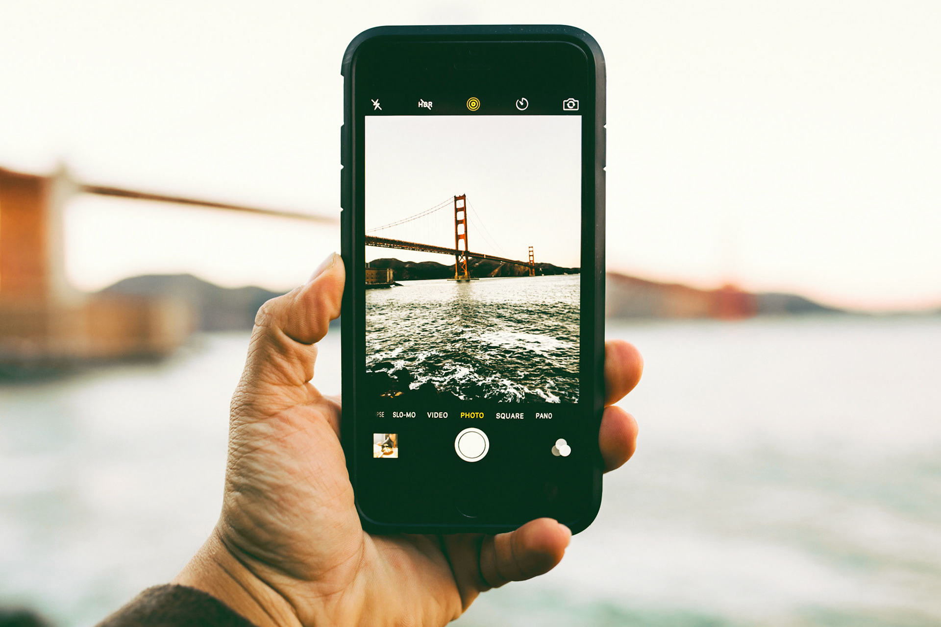

Ferrily is an app for riders of the SF Bay ferry system.
Problem: Getting more people to use the ferry system.
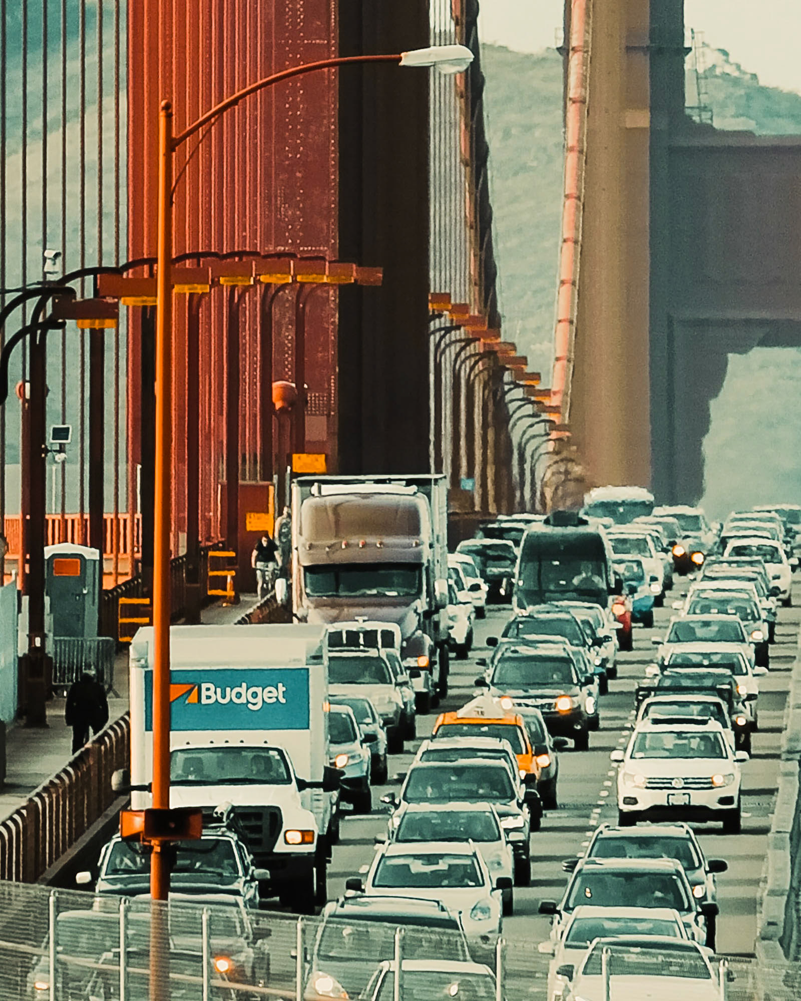
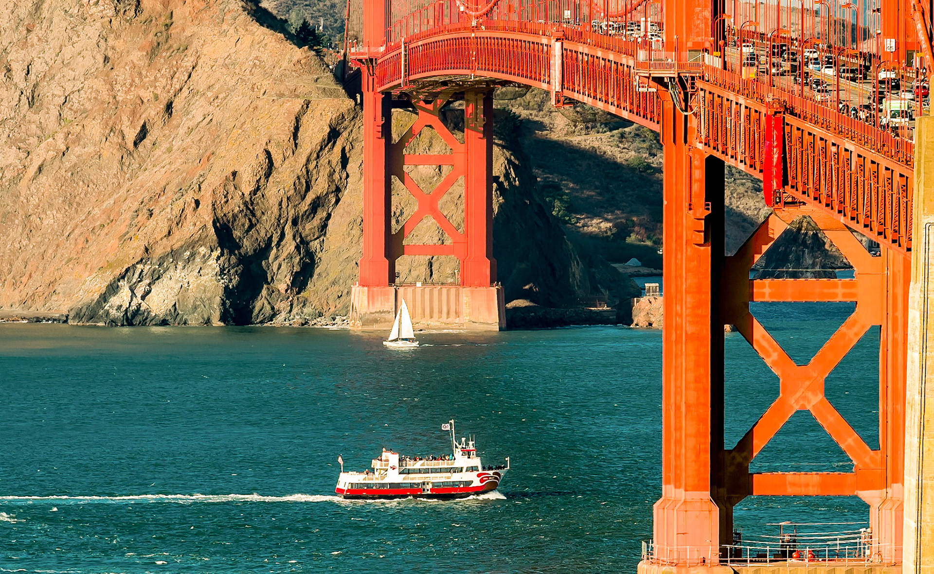
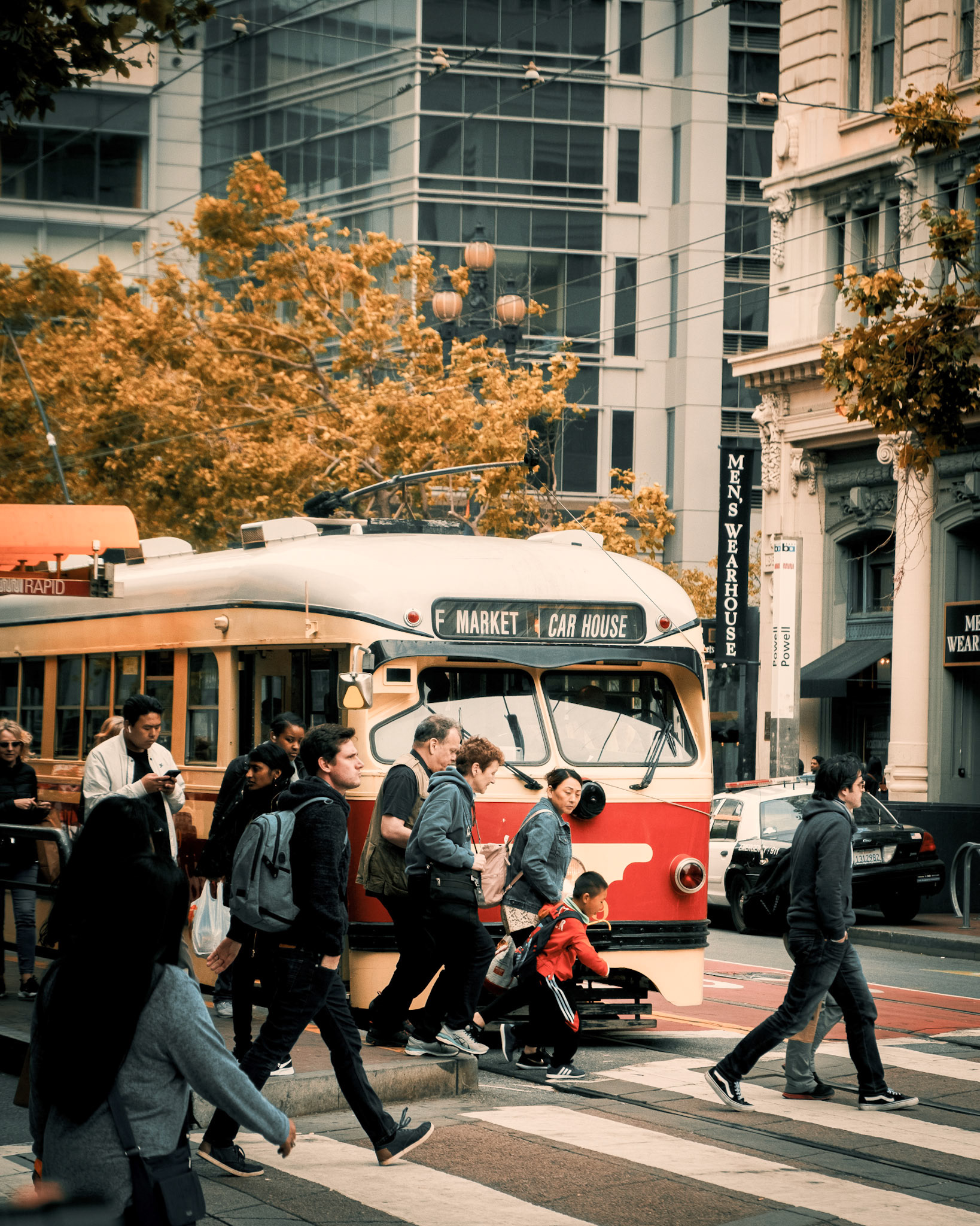
The ferry is a refreshing alternative to stifling Bay Area traffic and crowded mass transit. The State of California has made a significant investment into reviving the ferry system, yet it remains underutilized.
Solution: Make it easy to use the ferry. The Ferrily app provides a needed consolidated payment platform, scheduling and location information.
Why is the SF Bay Ferry System this way? Historically, the ferry system was run by a network of independent operators, each with a few routes, a structure that exists to this day. The system lacks a means to consolidate ticketing, payment, schedules and ferry location information. This makes the ferry a confusing, inconvenient experience for new riders. The Ferrily app consolidates ticket purchases and important information about routes, docks, boats, and scheduling. Ferrily makes catching the ferry as simple as it is delightful.
Overview
This project consists of the research and design of a consolidated ticketing and scheduling app for riders of the SF Bay ferry system, including:
- Historical research and mechanics of the ferry service
- User Research (wants and needs, user journey, persona development)
- Design (app features & tasks, scenarios)
- Wireframing (design covers route selection, ticket purchase and booking return ticket)
- Prototyping (3 rounds: sketched, paper, clickable)
Duration:
Ferrily project ran from October through December 2018, as part of UX coursework for the Masters in Graphic & Web Design program at the Minneapolis College of Art & Design.
Research
History of the SF Bay Ferry System
As of 2018 there were four separate ferry services in the area: Sausalito Ferry, Tiburon Ferry, Blue and Gold Fleet, the San Francisco Bay Ferry; and Tideline Marine Group. These operators run five distinct routes to destinations across the San Francisco bay, including commuter service to the cities of San Francisco and Oakland, and recreational routes to Angel Island and Sausalito.
Current day ferry service mimics the fragmented historical structure of a mix of small, local operators with municipal providers. This system is problematic for riders. There is no centralized repository for ferry routes, schedules or ticketing. Some operators sell tickets on their websites, others do not. As such, searching for ferry schedules and purchasing tickets can be difficult and inconvenient. Signage and location information for each ferry provider also vary. As smaller ferry "terminals" in are often simply a dock, tucked away in a local marina, this can be confusing for new or infrequent riders.
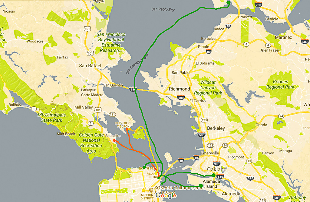
The SF Bay Ferry System routes, as shown in red and green. Apart from the SF Bay Ferry, which is state government operated, routes are largely operated by small independent providers.
Opportunity
The competitive landscape is wide open. No consolidated ferry schedule and ticketing apps exist for the SF Bay Area system.
The handful of ferry apps for the Bay Area offer only limited schedules and alerts for riders. None offer an app with purchase functionality. (Although, certain operators do offer web-based ticket purchase for their routes.) Details on the three existing apps are shown in the chart below.
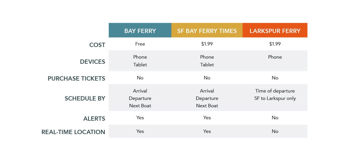
Comparison of available ferry apps. Each app is route centric, by operator. None allow in-app ticket purchases.
Users & Audience
Potential users of Ferrily are any of the 1.8 million daily riders of the Bay Area public transportation. This number includes commuters, business travelers, students, sports enthusiasts, fun-seeking city dwellers, tourists and a myriad of others.
Scope & Constraints
Ferrily is an iOS app. This project focuses on the Berkeley to San Francisco route currently operated by Tideline Marine Group.
Design
User Wants & Needs
I interviewed several subjects familiar with Bay Area public transportation. Two were students at UC Berkeley, who use a combination of public transportation, Uber, bikes and walking. One item that was important here is good information on where the ferry is located, not just an address.
The third lives in Minnesota and travels to the Bay Area for business regularly. Our business traveler uses the ferry to travel into the city for conferences and meetings. The ferry system allows her to book on short notice, as well as utilize less expensive hotel properties outside the city, while avoiding the hassle and delay of ground transportation.
The following chart explores the wants and needs of these travelers.
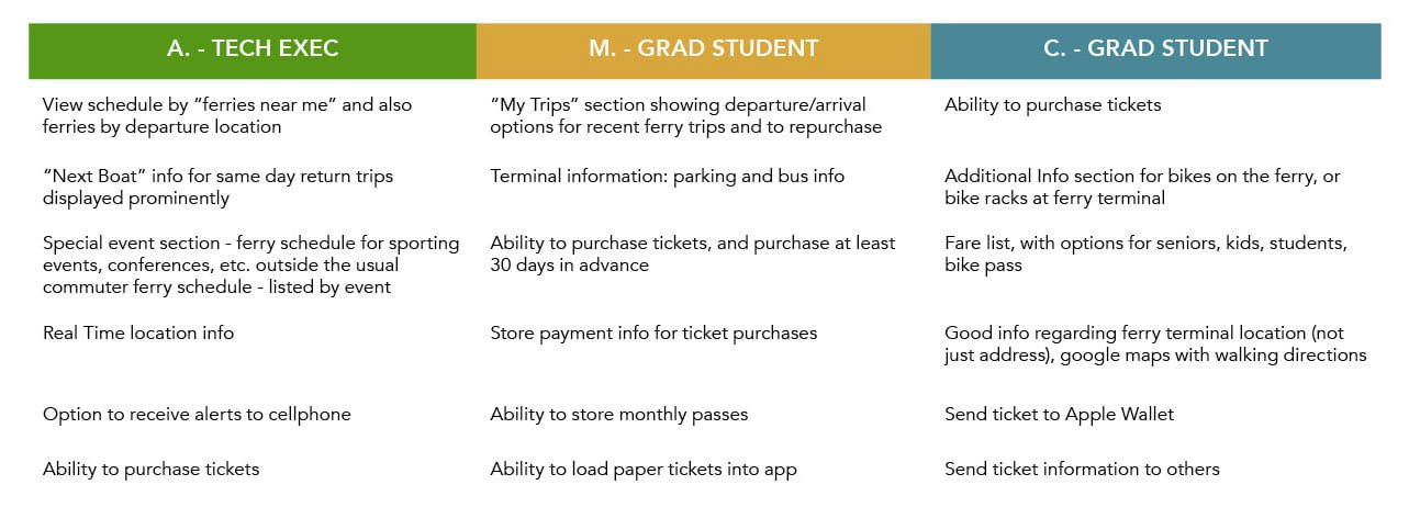
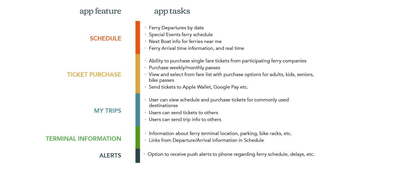
Information from the potential user interviews formed the base of the product requirements and tasks for use in the journey mapping and user flow stages of the design, as shown in the chart below.
User Persona
In exploring the app design, I visualized and evaluated number of user scenarios, as well as who might be the best user for the initial development of the app. The list included daily commuters, students, sports enthusiasts, fun-seeking city dwellers, tourists, and our business travel user.
For the initial stage of Ferrily, I chose the persona of Carrie Conference-Goer, an out-of-area business traveler attending a tech conference in the city of San Francisco.

User Journey
Carrie's conference is in San Francisco. However, she booked a hotel across the bay in Berkeley, as accommodations in the city were sold out. Carrie has a jam-packed conference schedule and needs travel to the city that will allow her to avoid the inevitable traffic snarls and delays. Carrie also needs the ability to book a return ticket, and share her travel arrangements with a team member.
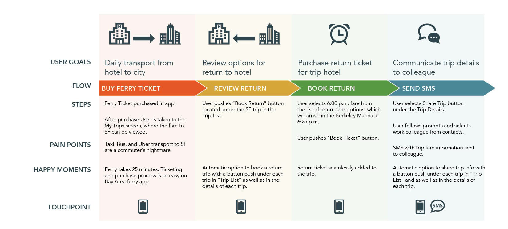
User journey for Carrie Conference-Goer, who commuted from her Berkeley hotel to SF for the Salesforce.com conference and saved time, money and sanity by avoiding traffic congestion and other ground traffic woes.
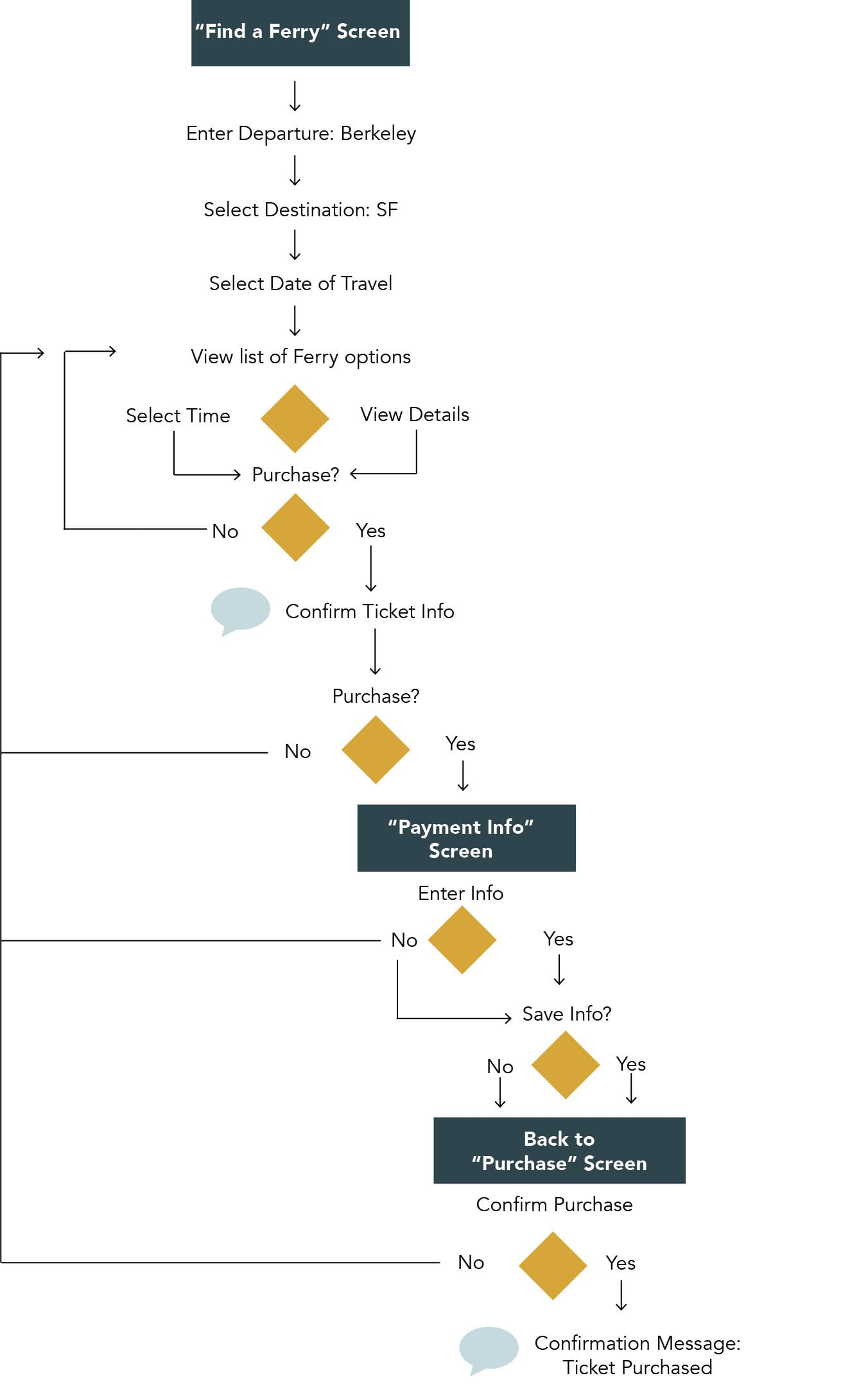
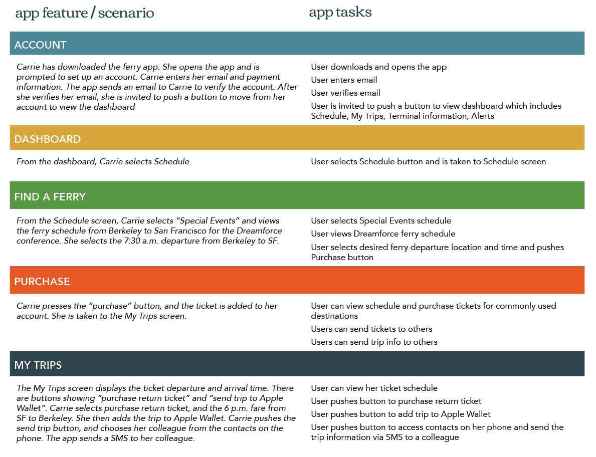
App Scenario, Tasks & Task Flow
I reviewed the product requirements and journey map to develop at a task flow (below) and marry the scenario with the app features and tasks.
User Testing
Three rounds of user testing were completed for the app, one at each stage of development:
1. Sketched Prototype (in person);
2. Paper Prototype (in person); and
3. Clickable prototype (remote).
For purposes of this document I summarized user testing due to the of information generated. Within each section are summaries of the test questions, task completion, and the most pertinent comments from testers. The summary information provided details the facts I found most relevant in the development and testing process.
Prototyping Round 1 - Sketched
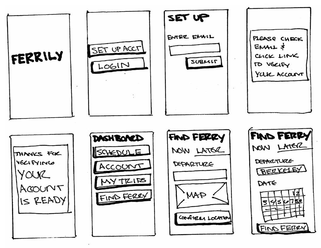
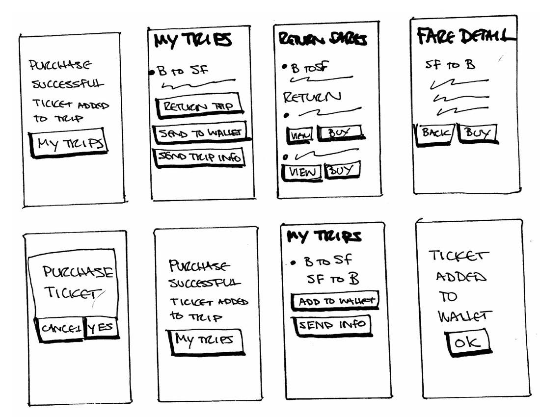
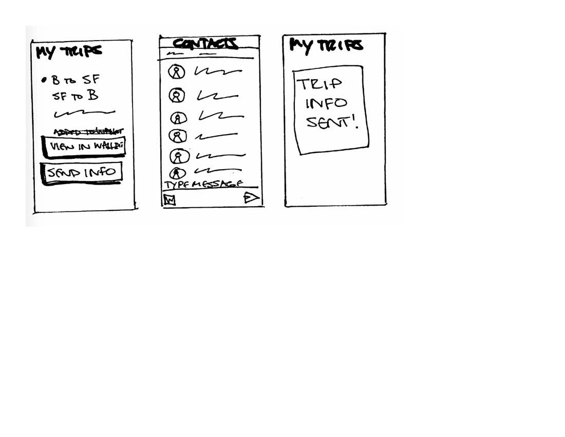
The task flow from the design phase was reviewed with the aim of making the process as smooth, and with as few clicks as possible. The wireframes developed were converted to rough sketches (shown above) for the first round of user testing.
Focus
Round 1 focused on task completion, including:
Account Set-up & Verification
Payment Method Entry
Post-purchase activities (adding trip to Wallet, sending trip info)
Expected Testing Outcome
The app has been streamlined significantly from the initial sketches and wireframes. The payment method entry has been taken out of the initial account set up, and now users are only prompted to enter payment method if a ticket will be purchased. The payment method will only be entered once. I feel that the payment screens need to be dialed in a bit more, but I’m curious how the users will find them.
Actual Outcome
The testing did not go as expected. While all users completed the tasks without prompting, 4 of the 5 users were a little confused at various points. Overall, the first four users were really challenging, possibly due to their tech background, and their experience in software development. They were very conscious about exactly how things appear on the screen and making sure next steps were clear - they didn’t want to read into anything. The last user was more junior, and pretty much breezed through the app.
I was surprised that no one cared or commented on the sequence and placement of payment screens, which was my primary concern going into testing.
Key Takeaways:
Users wanted to do so many things outside of how I envisioned the app working. The eight main items are listed below.
Account set-up. Some users do not want to set up an account - just want to browse ferry schedule. Need to explore if that makes sense.
Password. Is there a password? Setup needs to happen with account creation.
Text entry of date. Some users don’t like the calendar. They want ability to enter dates manually, rather than scroll through the calendar for dates in the further future.
Return trip booking. It would be easier to have option to book returns at initial ticket purchase, rather than making in a separate step. Separate step option should be there, but why not have it up front if you know you need a return.
Quantity needed. Some users are buying tickets for others. A quantity field is needed.
More Wallet buttons. Add to Wallet option should go on Purchase Success screen.
Purchase Success alert. This alert should just deliver user back to My Trips screen.
Alerts. Overall, should just disappear, rather than requiring clearing..
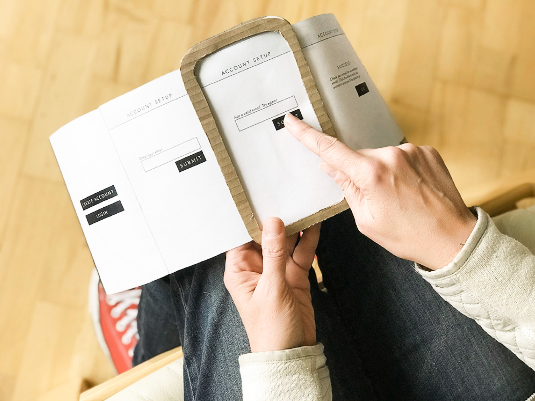
Prototyping Round 2 - Paper
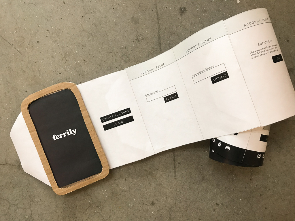
The paper prototype featured a roll of printed screens that advanced by pulling the tab to the left of the corrugated cardboard frame.
Prototype Construction
Armed with the knowledge gained from Round 1 of testing, the sketched wireframes were loaded into InDesign. The screens were futher refined, then printed to construct a physical paper prototype. The prototype was created in two parts:
Cardboard “phone”: two pieces of cardboard cut into the shape of a smartphone, with a screen-shaped cutout.
Screens: The screens were printed, cut out with a scissors, and taped together.
For the user testing, the taped string of screens was rolled up. As the user advanced through the test, the roll was pulled through the prototype phone, to simulate advancing to the next screen.
Testing Protocol
The unexpected results, confusion and requests for additional features in Round 1 of User Testing, I took a little time to reflect. Consideration incorporate as the sketches were converted into design software (Adobe InDesign) for testing in a physical paper protype with 5 users.
Focus
While functionality was unchanged, Round 2 of User Testing added new screens in an effort to make the process smoother and perhaps more intuitive. As the tasks were the same, we kept the questions along simlar lines. Please see the Round two testing packet for full details on the testing.
Testing Outcomes
All testers completed the tasks of successfully. Users moved through the prototype screens with relative ease. While there was no real confusion around how the screens worked, there was much conversation at each step in the process about how the app could autofill data from other apps (Amazon, Facebook) and around reducing the number of clicks in each step. While this discussion was interesting, it is not being considered for development at this juncture. Please note that in this round, none of the users had experience with the ferry ticketing process, SF Bay or otherwise.
Key Questions and Takeaways:
Several common themes were identified in the user testing. As most or all users identified these issues, they will be included in redesign:
Adding “BACK” buttons and exit options
Simplifying round-trip ticket options
More options for payments
Fewer confirmations required
Better information on the departures (time and location)
Arrival time (estimate or duration of trip if no arrival is available)
Add “Save Card” prompt to Payment Setup
Use of other means to set up account (currently is email)
Larger type on certain buttons
Adding options to send trip info from Purchase Confirmation screen
The following tasks were also noted by users, and will be placed on a backlog to review in future revisions of the Ferrily app: adding Card Scan functionality for payment options; adding “My Location” or “Near Me” function on map; autofill of account information from device contact card, other options for account setup (phone number, Facebook), and additional payment options, like Apple Pay.
Prototyping Round 3 - Clickable
The screens created in InDesign for Round 2 of User Testing were further revised with the learnings from the last round of testing. The resulting screen images were were uploaded to MarvelApp.com to create a clickable prototype. Within the Marvel platform, hotspots are created. The hotspots simulate app behavior by performing actions based on user behavior, such as clicking a button which is actually a hotspot that links to another page, or an alert that disappears after a preset amount of time.
Marvel creates a sharing link. The link is fully live and allows users to advance through the test version of app on their desktop or devices simulating an actual device behavior.
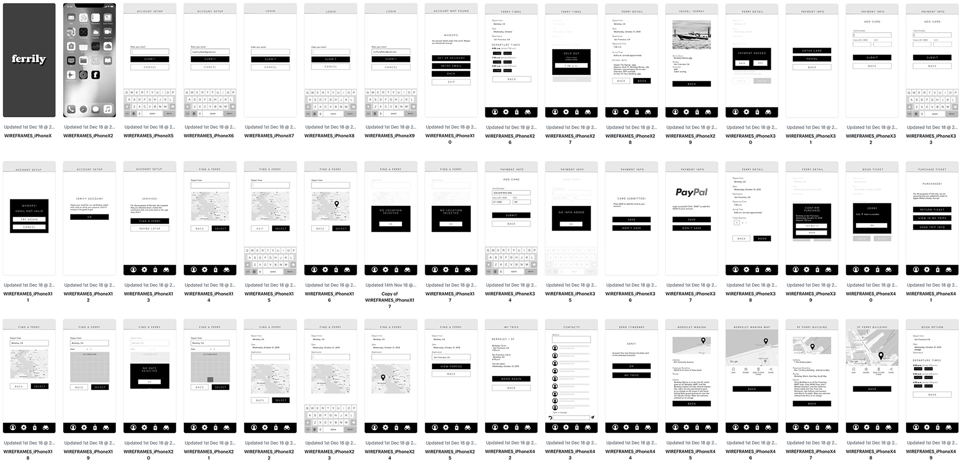
A sampling of the 70+ screens created for round 3 of prototyping. The screens were created in InDesign and uploaded to MarvelApp.com to create the clickable prototype for the user testing.
Focus
While Round 1 and Round 2 focused on the creating frictionless processes (setting up an account, selecting and booking tickets, and post-puchase activities such as adding ticket to Wallet and sending itinerary), Round 3 dealt with the actual mechanics of search and function of the app, i.e. does it make sense? Additional information for arrival times and duration of trips was added, and type sizes and button legibility was optimized. Email was retained as a method to verify account, as it provides a secondary contact point for the user’s account in case of a lost device, etc.
Testing Outcomes
This round of testing included trip selection and booking process, and timing of options such when to add payment information. Users seemed more comfortable with the clickable prototype than other testing methods. The clickable prototype felt more like a real app. As such, feedback was more realistic, direct and useful with the mechanics of paper prototypes mechanics of the paper prototype. Testing had a more natural flow, and the answers/conversation seemed more productive. The users moved through the prototype screens with ease.
Key Questions and Takeaways:
User sentiment was split on the majority of the items tested, i.e. when to add payment information, pin drops versus text entry, how to select dates, and if a confirmation would needed around items such as selecting a travel date. As such, these items will not change in future renditions of the app, and in instances where there is a choice for data entry of the items, such as setting travel locations, all will be retained.
Wrap-Up
The first two rounds of user testing developed smooth processes for the app. Then the third round, a clickable prototype, tested the logic of the processes developed, and in particular, how the app functioned in relation to popular car apps Uber and Lyft, i.e. rder of selection of departure and arrival destination.
In a follow up, the Round 3 users were queried about their preference for pin drops on a map to keyboard entry for locations, drop down lists of ports, as well as auto-advance. The actual test questions are listed below for ease of reference.
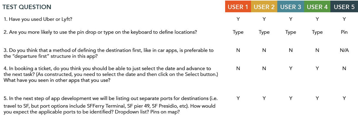
Key Questions and Takeaways:
All testers had some familiarity with Uber, Lyft, or both. Typing location (with an autocomplete) was preferred, despite it being more manual, as users felt it was more accurate.
Users rejected the 'enter destination first' model used by car apps, based on the workings of the ferry system. Ferry services function with more like a airplane or a train than a car app such as Uber or Lyft. Options are much more limited on both the departure or and destination ends, i.e. “you can’t always get there from here”.
Three out of the group rejected auto advance, based on frustrations of entry errors and not being able to confirm what has been entered before advancing and having to return to the previous step to correct. My conclusion was to leave the these features as-is in the final version of the app prototype.
The final question dealt with drop-downs listing out ports for destinations. All five users thought this feature would be an enhancement. However, for this user journey (entailing a trip from Berkeley to SF to attend a conference), there are no other ports available than the Port of San Francisco. The Berkeley ferry is operated by one company, Tideline Ferry. Tideline has a handful of small boats, seating up to 30 passengers, and runs a route to and from San Francisco. It does not currently travel to other ports. As such, there is no need for dropdown ports in this testing scenario, as there is only one option for Berkeley - the Tideline dock at the Port of San Francisco. We will reserve exploration of additional ports and functionality when additional user journeys are developed.