
UX Homepage Redesign
Problem: Law firm seeks a website that stacks up against key competitors.
Approach: User flow analysis, content reorg, and user testing.
About: This 30+ year old litigation firm prosecutes and defends some of the toughest, largest, most complex financial cases in the country. The firm’s attorneys have tried more than 230 cases to verdict or award – resulting in hundreds of millions of dollars won or saved for its clients.
Project Scope: The UX and website refresh was part of a full branding endeavor that also included full-page advertising and social media strategy. (Full project here.)
Design Process
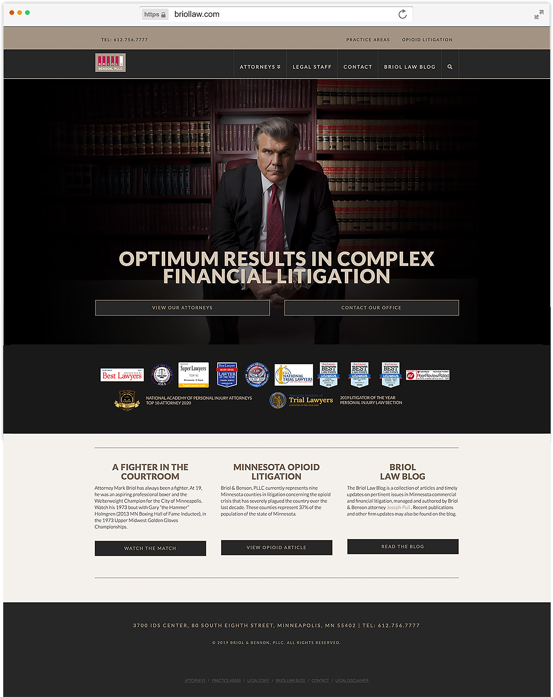
The firm wanted a more streamlined approach to the website, but had identified no specific pain points. Analysis of the homepage's user flows (direct and organic search traffic) helped to prioritize high traffic areas:
1) 'Attorneys' page
2) 'Contact' page
3) 'Legal Staff'
4) 'Law Blog'
The design focused on essential information and removed less important content that did not need to be on the homepage, like dated press articles. However, these needed to be balanced with client priorities, including a professional boxing video, accolades bar, and information on a prominent ongoing case. Less frequently used or non-revenue related assets were moved to the site's top bar, or removed from the home page altogether.
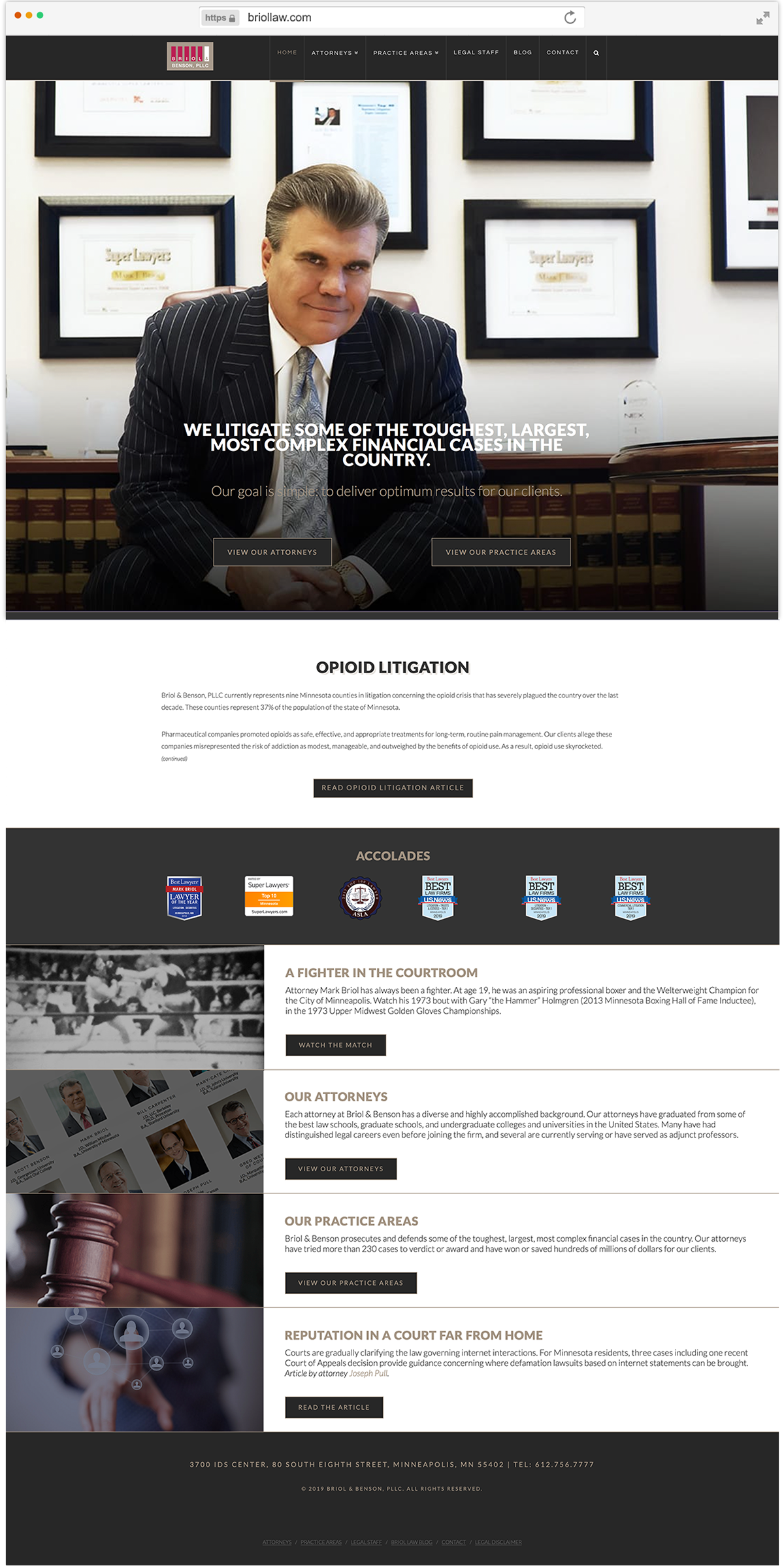
Below is the old homepage (left), versus the redesign (right).
Remote User Testing
The new prototype site was tested against the websites of firm's two largest local competitors, using four demographically relevant testers.
The testers visited each site remotely and completed a series of tasks including reviewing attorney profiles, and finding the location and contact information for each office - just as a newly referred client might.
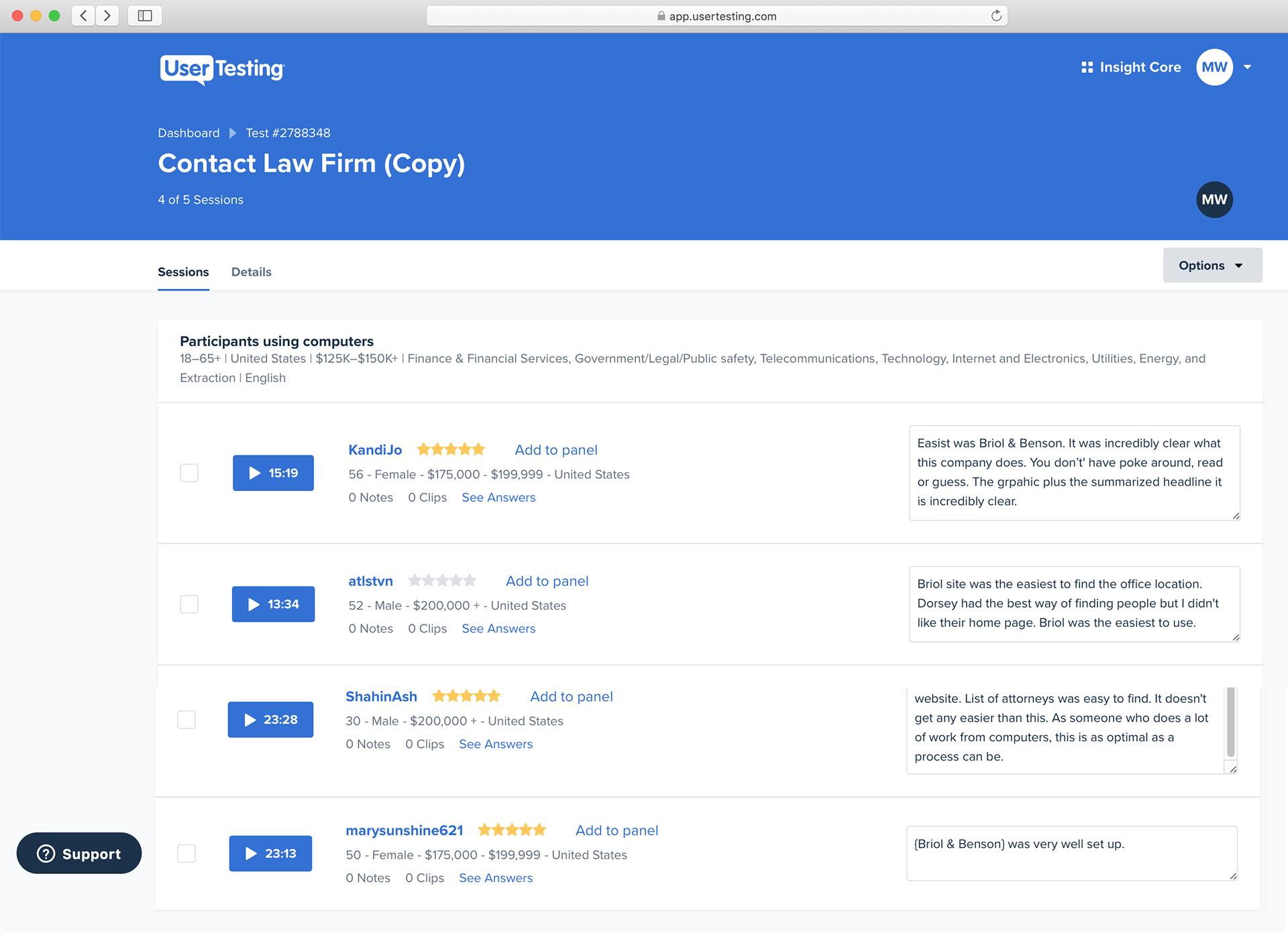
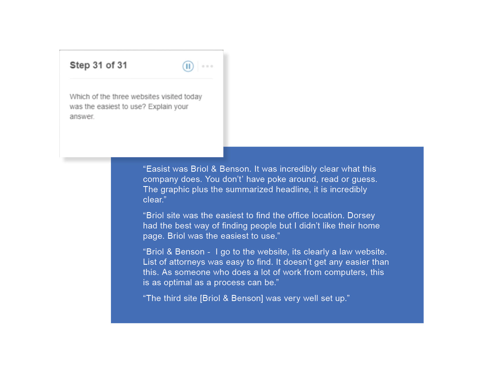
User Testing Result:
The firm's newly designed site ranked above the two competitor sites. All four testers ranked it highest in ease of use.
"[Location info] is easy to find, everything right there. This was the easiest experience."
"Loved the simplicity. Very obvious exactly what this company can do for you."
"The Briol site was very well set up."
"This site is clearly a legal website... it doesn't get any easier than this."
UX Testing Takeaways
User feedback confirmed the validity of the redesign, but also highlighted a few potential improvements. Users suggested making the phone numbers easier to find, and making it easier to contact the individual attorneys in general.
In response, we added the firm's main phone number to each attorney's page (the firm doesn't publish extensions) and the firm's address, as well as email, VCF and bio download buttons.